
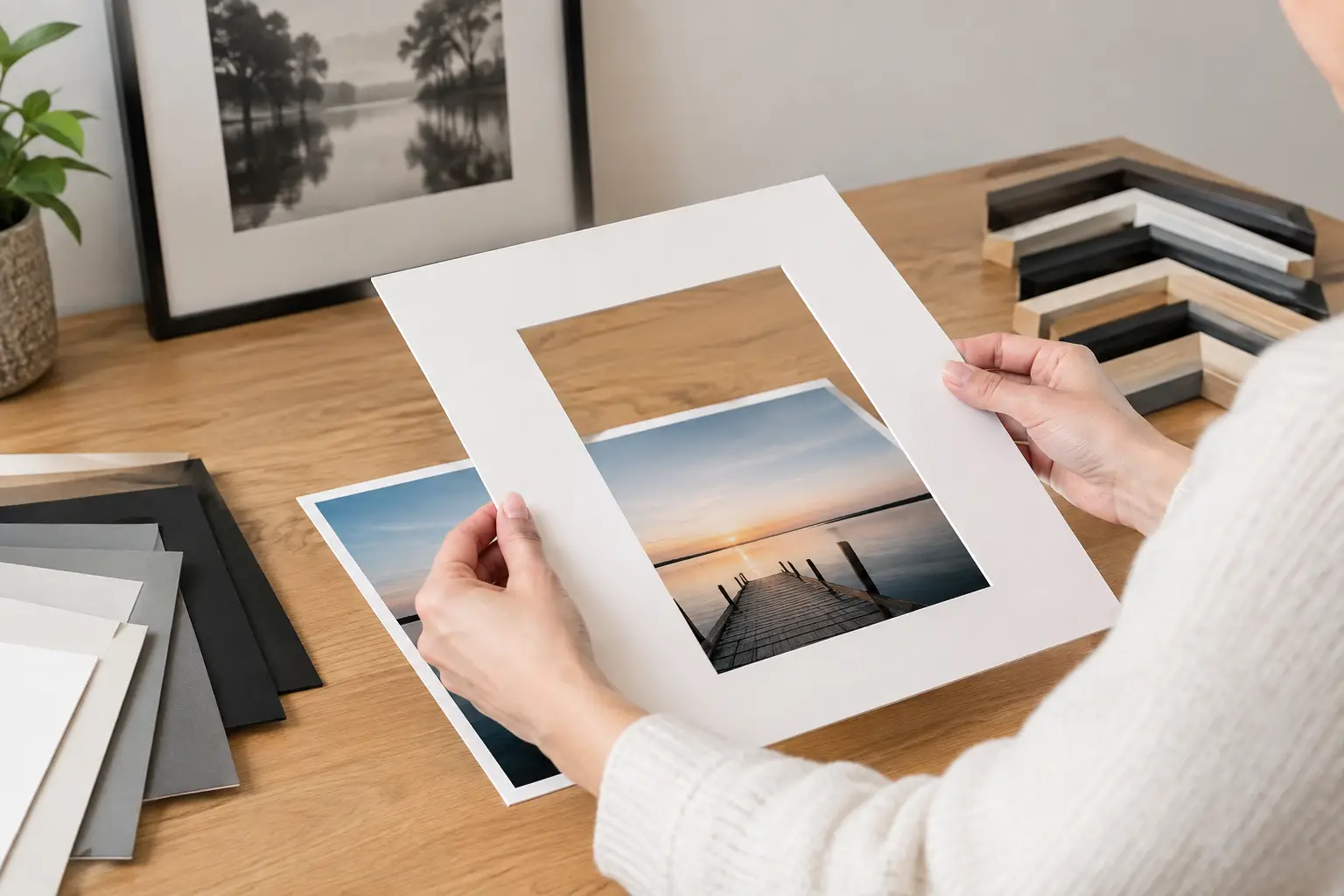
A photo that means a lot to you deserves more than just a standard frame. When choosing a mat for a photo, the space around the image determines how striking the photo is, how serene it looks, and whether it complements your interior. A well-chosen mat draws the eye, protects the artwork, and gives even a simple print a polished, gallery-quality look.
The right choice isn’t always the most obvious one. White is often beautiful, but not always. A wide frame can add impact to a small piece, but it can also be too overpowering. With a few thoughtful choices, you can come surprisingly close to a framing solution that will bring you joy for years to come.
Why a mat makes such a difference
A mat is the cardboard frame between the photo and the frame. It literally creates space between the image and the glass. This is not only aesthetically pleasing but also functional: when a photo is in direct contact with the glass, moisture, condensation, or sticking can cause damage over time.
Visually, a mat gives the photo some breathing room. It allows your eye a moment to rest before the image really begins. This makes details, contrasts, and colors stand out more clearly. Portraits, black-and-white photos, artistic photos, and atmospheric images benefit from this the most.
In addition, a mat helps improve the proportions. Otherwise, a small photo in a larger frame can look a bit lost. By adding a suitable border, the image takes on more presence on the wall without having to enlarge the photo itself.
Choosing a mat for a photo: Start with the photo itself
First, take a good look at what the photo needs—not just what goes well with your table, wall, or frame. The photo is the starting point. Is the image light and airy, dark and powerful, colorful, or perhaps subdued? The border should complement that character.
In a black-and-white portrait, off-white often looks softer than bright snow white. A warm white shade complements skin tones and analog photography beautifully. If the photo has a crisp, graphic look, however, a bright white mat can provide just the right contrast.
Composition is also a factor. A photo with a lot of empty space—such as a landscape with sky—often works well with a wider border. In a photo rich in detail, however, a border that’s too wide can distract the viewer. In that case, a more modest size usually makes a stronger impact.
Pay attention to the colors in the image
You don’t need to match the mat’s color exactly to the photo. That can quickly make the result look too contrived. Instead, choose a shade that picks up on an undertone in the image: warm beige for sandy tones, soft gray for a cityscape, or deep anthracite for a photo with strong contrast.
A dark mat can look stunning with light-colored images or black-and-white photography. It adds depth and a luxurious look. However, it requires careful coordination with the frame. For example, dark mat board paired with a heavy black frame can make a small photo look too closed off. A lighter wooden frame or a slim metal frame can help restore balance.
What width works best for your photo?
There’s no hard-and-fast rule for width, but there are proportions that almost always look good. A mat of about 5 to 8 centimeters is a good starting point for many photo sizes. For larger pieces, the border can be wider. For a small photo, a wide border can actually look surprisingly chic, as long as the frame isn’t too bulky.
A practical rule of thumb: the smaller and more detailed the photo, the more a slightly wider border can add a sense of calm. For example, a 13 x 18-centimeter photo can look great in a 30 x 40-centimeter frame with a generous mat. This gives the image the attention it might otherwise lack.
Also consider where the photo will be hung. Above a sideboard or in a spacious entryway, a piece can have more depth. On a wall filled with photos, a narrow mat is often a better choice, because otherwise all the mats together will dominate the space.
Centered or optically balanced?
The cutout in a mat doesn’t always have to be exactly in the center. For portrait-oriented photos, the bottom edge is often made slightly wider. This looks more natural to the eye and gives the photo a clean, professional look.
In a horizontal landscape photo, a uniform edge can actually work well. Does the image have a clear horizon or a lot of space on one side? In that case, a specialist can advise whether a subtle shift would strengthen the composition. You don’t always notice these kinds of small choices right away, but you’ll definitely notice them in the sense of calm in the final result.
The frame and the mat should complement each other
Never choose a mat separately from the frame. The frame forms the outer border, while the mat creates the transition to the photo. Together, they determine whether the framing will be modern, warm, minimalist, or bold.
A thin black aluminum frame with a white mat complements contemporary photography and a minimalist interior. An oak frame with a natural white or sand-colored edge adds warmth and looks great with family photos, travel photos, and soft colors. For a classic look, a dark brown or black wooden frame with off-white mat board can be a great choice.
Don’t try to incorporate every color in your interior. A frame doesn’t have to match every chair or vase exactly. In fact, it’s nice when a picture remains a standout feature on its own. Focus especially on materials and atmosphere: cool or warm, light or dark, calm or expressive.
Choose quality that protects the photo
Not every mat is suitable for a photo you want to keep looking good for a long time. It’s best to choose acid-free, colorfast cardstock. Regular cardstock can discolor over time or release substances that damage a print. Especially for original photos, limited editions, cherished family photos, and fine art photography, archival-quality materials are a wise choice.
The glass also deserves attention. Standard clear glass is fine for many applications, but in a bright room, reflections can be distracting. Anti-reflective glass makes a big difference when the photo is hung opposite windows or when you view the piece from different angles. UV-resistant glass also helps limit discoloration caused by sunlight.
That doesn’t mean you always need the most elaborate option. For a photo in a dark hallway, anti-reflective glass is less important than for an art print in a sunny living room. The best choice depends on the value of the photo, where it will hang on the wall, and how much light comes in.
Common Choices That Don’t Turn Out So Well
The most common mistake is using a mat that’s too small or too narrow. This causes the photo to sit too close to the frame, losing the sense of balance that a mat is meant to provide. A bright white border can also look harsh when paired with a warm, nostalgic photo.
Another pitfall is a crop that cuts off too much of the photo. Sometimes this is done to fit a standard size, but doing so can ruin a carefully chosen composition. Therefore, always make sure the crop fits the image. If that means the frame size varies slightly, custom framing is often the better investment.
Finally: don’t make your choice based solely on a small color swatch. Cardstock looks different next to the actual photo, under glass, and in the light of your own room. So, lay the materials side by side and examine them in both natural and artificial light before you decide.
Let your eyes—and the space—help you choose
Framing a photo is a personal choice. Sometimes a striking image calls for a very understated frame. Other times, a subdued photo actually needs a dark border to make a stronger impact. So while there’s no one “right” combination, there is a combination that works for your image and your interior.
Feel free to bring your photo with you if you’d like to compare different options. At Amersfoort Art, you can view materials, frame profiles, and mat colors side by side and get advice tailored to both the photo and the space where it will be displayed. That way, the frame isn’t just an afterthought, but a natural part of the image you love to see every day.


