A bare meeting room often says more than you want it to. Not only about taste, but also about consideration for employees, visitors and the look and feel of your organization. Choosing art for the office is therefore not a final styling step that comes with it. It is a decision that affects atmosphere, concentration, representation and how a space is experienced on a daily basis.
Why art in the office does more than fill in
Good art makes a workspace more human. That sounds simple, but especially in business environments, that difference is significant. An office often consists of functional elements: desks, screens, lighting, acoustic solutions and walkways. Without art, such an environment quickly feels technical or anonymous.
A carefully chosen work adds character. In an entryway, it can exude confidence and quality. In a boardroom, it can bring calm or conviction. On a shop floor, it can add energy, rhythm or color. The effect is not only in what people like, but also in how it makes a space less harsh and more inviting.
At the same time, it’s good to stay sober. Art does not solve poor layout, chilly lighting or unsettled furnishings. It works best as part of the whole. For this very reason, a good choice does not start with a single work of art, but with the question of what the space needs.
Choosing art for office begins with the function of the space
Not every space requires the same kind of work. That is often the first mistake: choosing one style and implementing it everywhere. That can look calm, but can also become flat. It is better to look at each space according to use, length of stay and desired atmosphere.
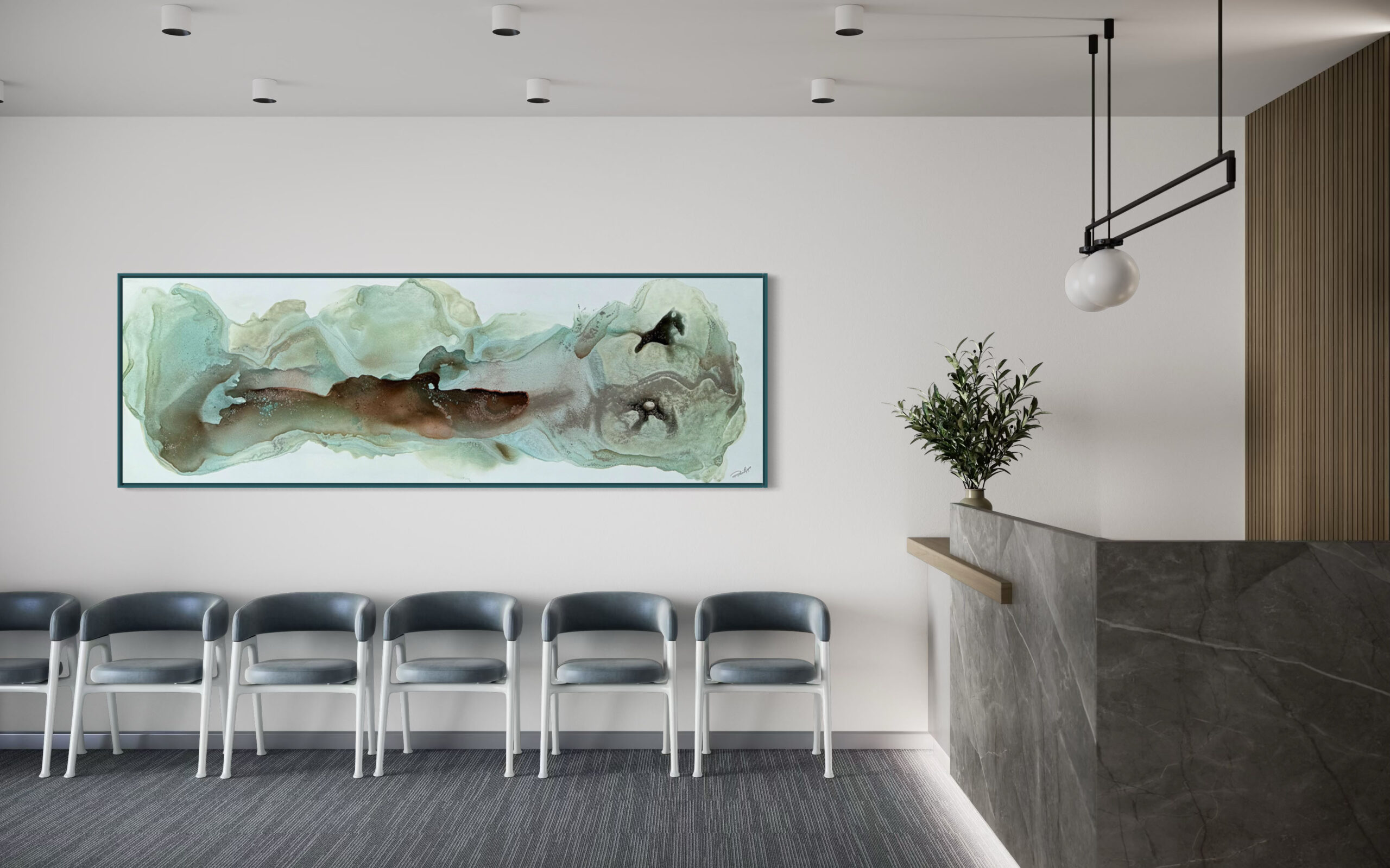
In a reception area, art may be a bit more outspoken. Here you often want to make a first impression. This can be done with a large work that is immediately visible, or with a composition that shows professionalism and taste without being too dominant. In conference rooms, art usually works better if it supports rather than takes over conversation. Too busy, too loud or too loaded can be distracting.
For workplaces, the situation is different again. There, art that brings calm, depth or a pleasing color accent helps. Employees look at it daily, so the work should not feel tiring after two weeks. In corridors and interspaces, on the other hand, a little more movement is possible. There, art may make a route more interesting and connect different zones.
Those who choose art by space get an office that is more right. Not because everything is identical, but because each work in the right place adds something.
What style fits your organization?
The question is rarely: what is great art? The better question is: what fits our business, our people and our visitors? A notary’s office, architectural firm, healthcare organization or creative agency does not require the same approach.
Abstract art is often a strong choice in the office precisely because it leaves room for your own interpretation. It can bring tension, tranquility or color without being too literal. That makes it suitable for many business environments. Figurative work, on the other hand, can feel warmer and more accessible, but requires more fine-tuning. Too specific a subject does not appeal to everyone and can be strongly controlling in atmosphere.
Material and technique also participate. Photography often brings clarity and modernity. Painting brings texture and layering. Graphic work can look sleek and contemporary. Sculptures or objects literally add an extra dimension, but require more space and proper placement.
It helps not to look only at personal preferences of one decision maker. A director may not necessarily choose something that would hang over the couch at home. In the office, the broader context counts: brand identity, interior design, type of visitors and daily use. Taste remains important, but in a business environment, appropriateness is at least as decisive.
Format, color and placement make or break the result
Even a strong piece of art can fall away if the size isn’t right. A common problem is choosing too small. Especially in the office, where walls are larger and ceilings can look higher, small work quickly disappears into the space. Then it looks like something is hanging, but to no real effect.
A large work above a dresser, in an entryway or on a long wall often brings instant calm. That sounds contradictory, but one powerful piece usually works more calmly than several small works vying for attention. On the other hand, a series of smaller works can be just right in a hallway or waiting room, where people are moving and moving closer to the wall.
Color deserves equal attention. Art does not have to be the exact same hues as the interior, but connection helps. Think repetition, contrast and balance rather than perfect matching. In a neutral office, a pronounced color accent can do a lot. In a space where there are already many visual stimuli, a quieter palette is often stronger.
After all, placement is not a detail. Height, incidence of light, reflection on glass and viewing distance help determine how a work comes across. Especially with art behind glass or in rooms with many windows, it is smart to look at reflection and daylight beforehand. A well-chosen work deserves a place where it really comes into its own.
Rent art, buy it or experience it first?
Not every company wants to buy right away, and that’s understandable. Art in the office has to fit taste, budget and use. Sometimes you know exactly what you’re looking for and buying makes sense. In other cases, flexibility is more appealing.
Renting or starting through an art loan then offers a solution. It lowers the threshold, especially if you want to furnish several rooms or first experience how a work feels in practice. A work of art may be convincing in the gallery, but may turn out differently in the office because of light, scale or environment. Then it is nice if you are not immediately stuck with a definitive choice.
For companies that regularly renew their interiors, changing is also interesting. This keeps the look fresh without going through a major purchase process over and over again. On the other hand, those looking for a durable addition to the interior will be more inclined to buy. Both routes can be good. It depends on budget, decision-making and how definitive you want to make the interior.
Common mistakes when choosing art for office
The biggest mistake is choosing out of haste. Art is then only looked at when the office is almost finished and the budget is largely spent. The result: compromises, works that are too small or choices that feel especially safe.
A second mistake is selecting too bravely. Of course, art in the office does not have to be confrontational, but completely colorless choices rarely make a space better. Art may well evoke something. Not to shock, but to have presence.
It also often happens that companies view art separately from presentation. A good frame, the right hanging system and neat workmanship make a lot of difference. A strong work in the wrong frame still looks thoughtless. Especially in a professional environment, that finish counts.
Finally, the target audience in the space is sometimes forgotten. Art for a publicly accessible space requires a different approach than art in a private executive office. Employees, customers and guests do not experience the same walls in the same way. Those who take this into account in advance make sharper choices.
Here’s how to make the choice easier
Start small, but not without commitment. First, choose one or two areas that are most visible, such as the entrance, meeting room or reception area. This will set the tone and give you a sense of direction. From there, you can build further.
Then work from photos, measurements and floor plans. That sounds practical, and it is. The better you can see wall widths, walking lines and existing colors, the more focused the advice can be. When in doubt, visualization on the wall often helps tremendously. Then you can see not only whether a work is beautiful, but also whether it fits in proportion.
An expert outside view usually makes the process faster and better. Not because you have no taste yourself, but because choosing art for the office touches several interests at once. Aesthetics, budget, representation and use must come together. A gallery or art partner who thinks along about selection, presentation, framing and placement removes a lot of uncertainty. At Amersfoort Art, we often see that this very combination of advice and flexibility helps companies choose with more confidence.
The most pleasant office is rarely the sleekest or most expensive office. It is the place where form, function and atmosphere support each other. Art helps with this, provided it is not treated as a closing item. So look not just at what fits on the wall, but at what your space needs to feel more pleasant, stronger and more human. That is often exactly where a good choice begins.


