A painting can be beautiful on its own, but with the wrong frame it still feels just not finished. If you ask yourself which frame suits a painting, you soon realize that there is no standard answer. The right choice depends on the work, the space and the effect you want to achieve on the wall.
Which frame fits a painting in your interior?
Many people look at the painting first and then at the frame. This is understandable, but in practice the two always work together. A frame determines how calm, powerful or sophisticated a work of art appears. Even a subtle border can make a big difference in how colors, contrasts and details are perceived.
Therefore, it is smart to ask not only what frame is beautiful, but more importantly, what frame supports the painting. A good frame does not draw all the attention to itself, but helps the work stand out better. At the same time, that frame should also fit the place where the painting hangs. What works well in a sleek office may look too cool in a warm home interior.
Start with the painting itself
The style of the work is usually the best starting point. A modern, abstract painting often requires a different approach than a classic or figurative work. With contemporary art, you can often see that a narrow, tight tray frame or minimalist frame gives much peace of mind. The work is then given space without the frame competing.
For expressive paintings with lots of texture, powerful brushstrokes or deep colors, a frame can actually add body. Think wood with character or a slightly wider edge that gives the work strength. In the case of a fine, subdued painting, this sometimes works less well, because the image then appears heavier than intended.
The technique also plays a role. A canvas on stretcher is often framed differently than work on paper. For a painting on canvas, a picture frame is popular because it frames the work without covering the picture plane. This gives a modern, neat look. For works on paper, glass is usually required and the choice of profile, color and possibly a passe-partout becomes different again.
Color: go with or contrast
One of the first choices is the color of the frame. Black, white and wood tones remain popular because they can carry a lot, but again, it depends on the painting.
A black frame often provides contrast and sharpness. This works well for modern art, graphic images and works with distinct shapes. Black can give a painting more presence, especially on a light wall. At the same time, it can look too harsh on soft colors or an airy composition.
A white frame looks fresh and calm. It often goes well with light interiors and subtle works of art. But on a white wall, a white frame can sometimes look out of place, especially if the painting itself has little contrast.
Wood brings warmth. Light oak tones fit well with Scandinavian and natural interiors, while dark wood can add depth and classic elegance. The advantage of wood is that it looks less severe than black and often blends more kindly into a living space. The disadvantage is that the wood tone has to be just right. A shade that is too yellowish or too red can clash with both the work and the interior.
Sometimes contrast is actually the best choice. A sober painting in soft tones can become stronger in a dark frame. Conversely, a powerful and colorful work can benefit from a quiet, neutral frame. The goal is not that everything matches exactly, but that painting and frame enhance each other.
The width of the frame determines the look
Not only color, the width of the frame also does a lot. A narrow frame often looks modern and refined. This keeps attention close to the image. This works well with contemporary art and in interiors where tranquility is important.
A wider frame makes the whole look more emphatic. This can help with a larger painting or with a work that is given a prominent place. In a high room or above a generously sized sofa, it is sometimes okay for a frame to have more volume, otherwise the whole thing visually disappears into its surroundings.
There is also a practical consideration here. A small work with too wide a frame can quickly appear heavy or dated. A large painting with a very narrow profile can actually look unfinished. So proportion is more important than whether a frame is beautiful in itself.
When a baking frame is a good choice
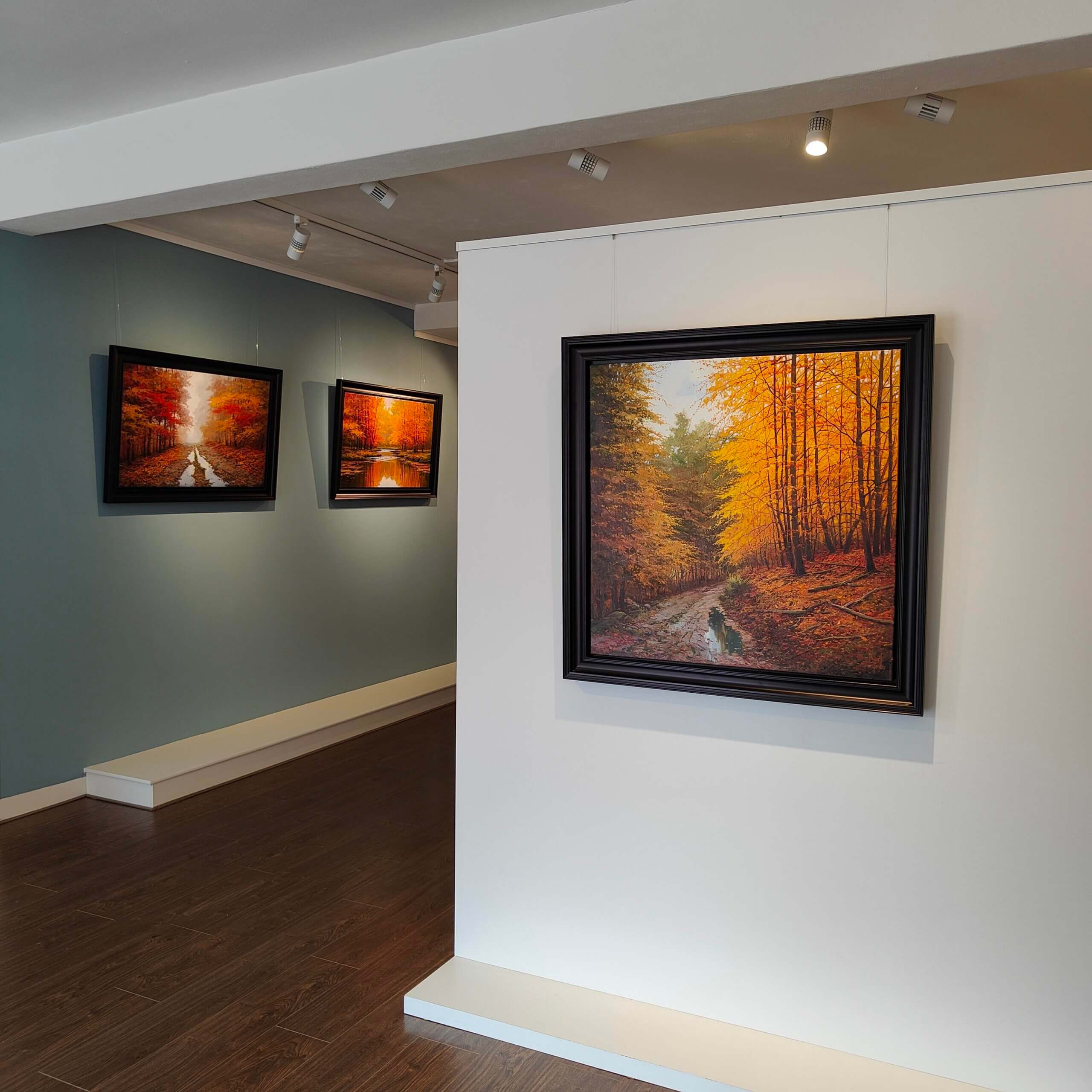
For many paintings on canvas, a tray frame is a logical option. The canvas seems to float in the frame, so to speak, with a small space between the painting and the edge. This keeps the work airy while still providing a clear frame.
A bin frame fits especially well with modern and contemporary art. Black gives a powerful effect, white keeps it light, and wood provides warmth. For very classical paintings or romantic representations, a tight picture frame sometimes feels a bit too austere. Then a more traditional profile may fit better.
Also look at the space around the painting
Those who only look at the artwork are missing part of the story. This is because a frame should not only match the painting, but also the wall, the light and the furniture around it. In a sleek interior with muted colors, a simple frame often comes out better. In a room with many materials, fabrics and warm accents, the frame may also be a little richer or softer.
In this, the color of the wall is surprisingly decisive. On a dark wall, a black frame can disappear and actually look very chic. On a light wall, that same frame gives a clear framework. A wooden frame can be beautiful on a warm sand-colored wall, but less convincing on cool gray if the undertone is not right.
Light also plays a role. In rooms with lots of daylight, subtle nuances in wood and lacquer stand out more. In a somewhat darker room, more contrast often works better. This way, the painting remains legible even at a distance.
Which frame fits painting with passe-partout?
With paintings on canvas, a passe-partout is not usually an issue, but with work on paper it can do a lot. A mat gives air and distance between image and frame. It looks neat and helps focus attention.
White or off-white is often a safe and beautiful choice, but not always the best. For warm toned art, a too cool white can sometimes be distracting. For graphic or photographic work, on the other hand, a bright white can be very fresh. The width of the passe-partout also influences its appearance. Wider looks quieter and chic, narrower looks more modern and direct.
An important advantage is that a passe-partout can give a modest work more presence. It makes a small format less vulnerable on the wall. At the same time, it should not become so dominant that the image gets lost in it.
Common choices that don’t work as well in hindsight
Choosing a frame based on trends alone is rarely the best route. What looks stylish in a photograph may not turn out well at home. Especially very striking metallic frames, extremely wide profiles or highly decorative borders can quickly take attention away from the painting.
Another pitfall is wanting to match furniture too much. Of course a frame may match the interior, but it does not have to be a copy of the dining table or floor. Art is also allowed to have its own place. If everything is matched too literally, the work often loses its tension.
Practically speaking, it also pays to look beyond appearance alone. Glass, material, hanging system and finish make a difference in daily use. Especially with larger works or art in a business space, solidity is at least as important as appearance.
Personal advice makes all the difference
Precisely because so much depends on nuance, framing is not a purely technical choice. It is a combination of taste, proportions and experience. Sometimes a frame that seems logical on paper turns out to be too heavy in reality. And sometimes an unexpected combination makes the painting stronger.
This is why it helps to really look at a work, preferably together with examples of profiles and colors. Then you can immediately see what a black frame does compared to natural wood, or how much peace a tray frame gives. For those who not only want to hang art beautifully, but really present it well, custom work is usually worthwhile. At Amersfoort Art, we often find that people only see how much influence the right frame has on the overall look while comparing.
In the end, the best frame is not the most striking or the most expensive, but the frame that makes the painting feel natural in the room. If the work speaks more, the wall feels more peaceful and the whole picture is right as soon as you walk in the door, then you are in the right place.


