
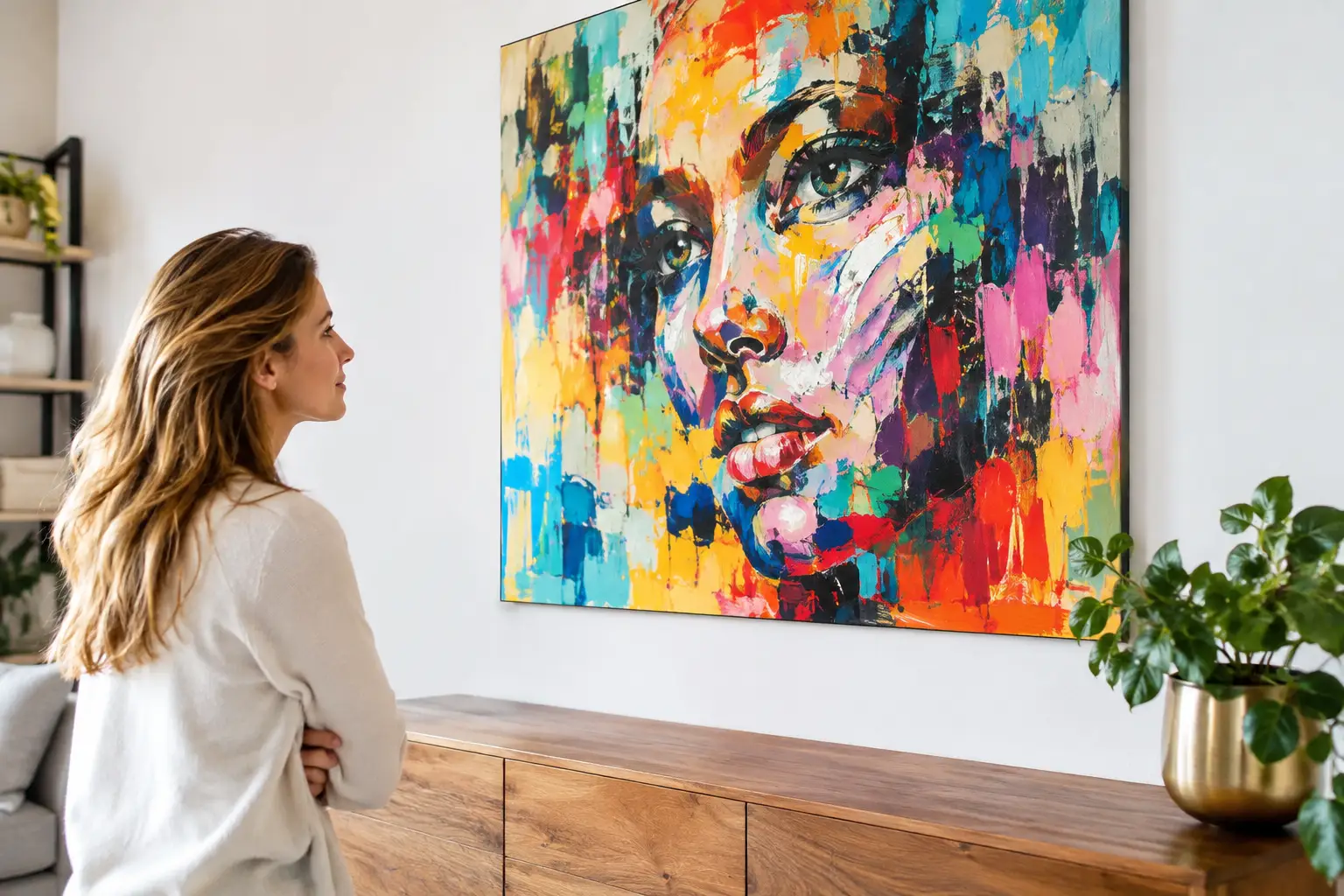
A colorful interior doesn’t automatically call for an exuberant work of art. Especially when walls, furniture, rugs, or accessories already feature a lot of color, making the right choice is what distinguishes a space with character from a room where everything competes for attention. Artists specializing in colorful interiors help you not only add more color, but above all, give color direction, tranquility, and personality.
It doesn’t start with the question of which color you like best. First, consider the atmosphere you want to maintain or enhance. Should a piece of art be the focal point above the couch? Or are you looking for a bold accent in an otherwise calm entryway? Or do you want to naturally tie together different colors in your interior? With a well-considered choice, art becomes not just a random addition, but a natural part of your home.
Which artists are a good fit for a colorful interior?
When it comes to colorful interiors, there are roughly two appealing approaches. You can choose art that echoes the existing colors or subtly picks up on them. For example, a painting featuring the same cobalt blue as your armchair, or a graphic piece that incorporates a warm ochre hue from your rug, creates cohesion without making everything identical.
The other option is contrast. Imagine a vibrant abstract piece in fresh green and pink against a deep terracotta wall, or a serene black-and-white photograph in a room with lots of bold colors. Contrast creates a sense of space and ensures that both the interior and the artwork stand out more clearly. Which option works best depends on the amount of color already present, the natural light, and your own preference for tranquility or expressiveness.
Abstract Art for Color and Movement
Abstract artists are often an excellent choice when you want to let color speak for itself without hanging a literal subject on the wall. In abstract art, swaths of color, lines, texture, and transparent layers can infuse a space with energy. A bold stroke of paint fits beautifully in a modern living room, while geometric shapes can add structure to a playful interior.
Don’t just focus on the main color. The subtle nuances are often what make the difference. A painting that looks mostly blue from a distance may, upon closer inspection, contain hints of lilac, sand, red, or gray. It’s precisely those secondary and tertiary colors that can tie the painting into your interior.
Figurative art with a bold color palette
Figurative art can also work surprisingly well in a colorful interior. A portrait, landscape, cityscape, or still life brings a sense of familiarity and a story. When colors are used boldly, such a piece becomes a personal focal point without feeling distant.
A figurative artwork sometimes requires a bit more careful consideration. If your interior already features a lot of patterns, it’s best to choose a piece with a clear composition and plenty of calm areas. In a minimalist space, on the other hand, the artwork can be more layered and colorful. It’s not about strict rules, but about striking a good balance between visual calm and vibrancy.
How to Coordinate Art with the Colors in Your Home
A helpful first step is not to include every color in the room. Choose two or three shades to serve as the foundation: for example, the color of the wall, a dominant upholstery fabric, and an accent from a lamp or vase. Next, find a piece of art that incorporates at least one of these shades, even if only in a small detail. This makes the combination feel well-thought-out without becoming predictable.
Next, consider the color temperature. Warm colors such as red, orange, pink, and yellow often make a space feel inviting and energetic. Cool colors such as blue, green, and purple tend to create a calm or fresh atmosphere. A colorful piece of art can serve as a nice counterbalance to the existing color temperature. A cool blue wall gains more depth with a piece that features warm coral or golden yellow. In a warm interior, a bright blue can actually provide a refreshing contrast.
The materials in the space also play a role. Wood, brass, concrete, natural stone, and velvet all react differently to color. An expressive painting with a visible paint texture often feels like a natural fit with tactile materials such as wool and wood. A sleek, graphic piece frequently complements a more modern interior featuring metal, glass, or smooth surfaces.
Size is just as important as color
A small piece of art on a large, empty wall can lose its impact, no matter how beautiful the colors are. Conversely, a piece that’s too large can make the room feel visually overwhelming. So be sure to measure the available wall space before you fall in love with a particular size. Above a sofa, a piece of art often works well when it takes up about two-thirds of the sofa’s width. That’s not a rule, but it is a useful guideline.
In a colorful space, art can certainly be bold. One large piece often creates more tranquility than five small pieces, each vying for attention. If you’d still like to combine multiple pieces, stick to a unifying element: the same frame color, a matching shade, or a shared style. This creates a gallery-like effect that remains lively without becoming cluttered.
Don’t forget about the viewing height. Hang art in a sitting area slightly lower than in a hallway, since you’ll usually be viewing it while seated. In a room with high ceilings, a vertical piece can emphasize the height. Above a sideboard or dining table, a wide, horizontal piece creates balance.
The list adds a splash of color
With a colorful work of art, the frame is no afterthought. A slim black frame makes a piece look more graphic and provides a clean border, especially when there’s a lot of color on the wall or in the room. A wooden frame adds warmth and can make a painting more approachable. White or natural wood often creates more light and space around the image.
Sometimes a piece of art actually benefits from a simple frame, so that the colors take center stage. In other cases, the frame can be used to highlight a color in the artwork. This requires a customized approach, because the wrong frame can suddenly make a carefully chosen piece seem too heavy, too saccharine, or too chaotic. If you’re unsure, it’s a good idea to look at the artwork, the wall color, and a sample of the desired frame all together.
Experience it for yourself: renting art in a colorful home
Color behaves differently in every home. Daylight can make a soft green hue appear cool, while evening lighting can make the same color appear warmer. Even a piece of art that immediately captivates you in a gallery can take on an unexpectedly different role at home, depending on the furniture, wall color, and surrounding space.
That’s why renting art is a great option if you want to discover what really works. You can see how a painting looks at different times of the day and whether the work still resonates with you after a few weeks. This makes your decision less rushed and often a better one. At Amersfoort Art, you can rent art in an accessible way, build up a collection, and eventually purchase pieces, all while receiving personalized advice on display and framing.
Renting is also a good option for business spaces. A colorful piece of art can give a lobby, conference room, or workspace more character, but the desired atmosphere may change as a team grows, the interior is redesigned, or a space takes on a new function. Rotating the art keeps the environment lively and appropriate.
Dare to choose a work that doesn’t explain everything
The best choice in art is rarely the safest color match. A piece of art should surprise you, introduce an unfamiliar shade, or make an existing color feel more intense. If you find yourself wanting to look at a painting or sculpture again and again, that’s often a better sign than if it simply matches the throw pillows perfectly.
Take a photo of the space with you, view the artwork from a distance, and give yourself time to feel what’s happening. Art can bring color, but above all, it can add its own story to the place where you live or work every day.


