A good work of art often feels right immediately. Yet you don’t really notice it until you take a longer look: how the light falls on it, what it does to the space and whether the work continues to draw you in after a week. With a Jochem de Graaf painting, exactly that plays into it. It is work that not only stands out, but also continues to work in an interior.
If you are looking for art for your home or office, you are usually not just looking for a pretty picture. You are looking for atmosphere, balance and something personal. That’s why it pays to look not only at subject or color, but also at scale, material perception and the question of what a painting does to a space on a daily basis. Especially with an artist with a recognizable signature, that makes the difference between nice and totally hit the mark.
What makes a Jochem de Graaf painting attractive?
The appeal of a painting is rarely in one thing. It’s about the combination of composition, use of color, rhythm and the way a work evokes tension or tranquility. With an artist like Jochem de Graaf, many people look for that balance: work with character, but without taking over an interior.
This is an important distinction. Some art demands all the attention and works especially well in large, minimalist spaces. Other works blend easily but also quickly fade into the background. The best choice is often in between. You want a painting that is present without being obtrusive.
For private buyers, that often means that the work must fit a living space that is lived in. In a living room, hallway or dining room, art must stand up alongside furniture, lighting and daily dynamics. Something similar applies to business environments. A reception area or office requires charisma, but also tranquility and professionalism.
Not only beautiful, but fitting into your space
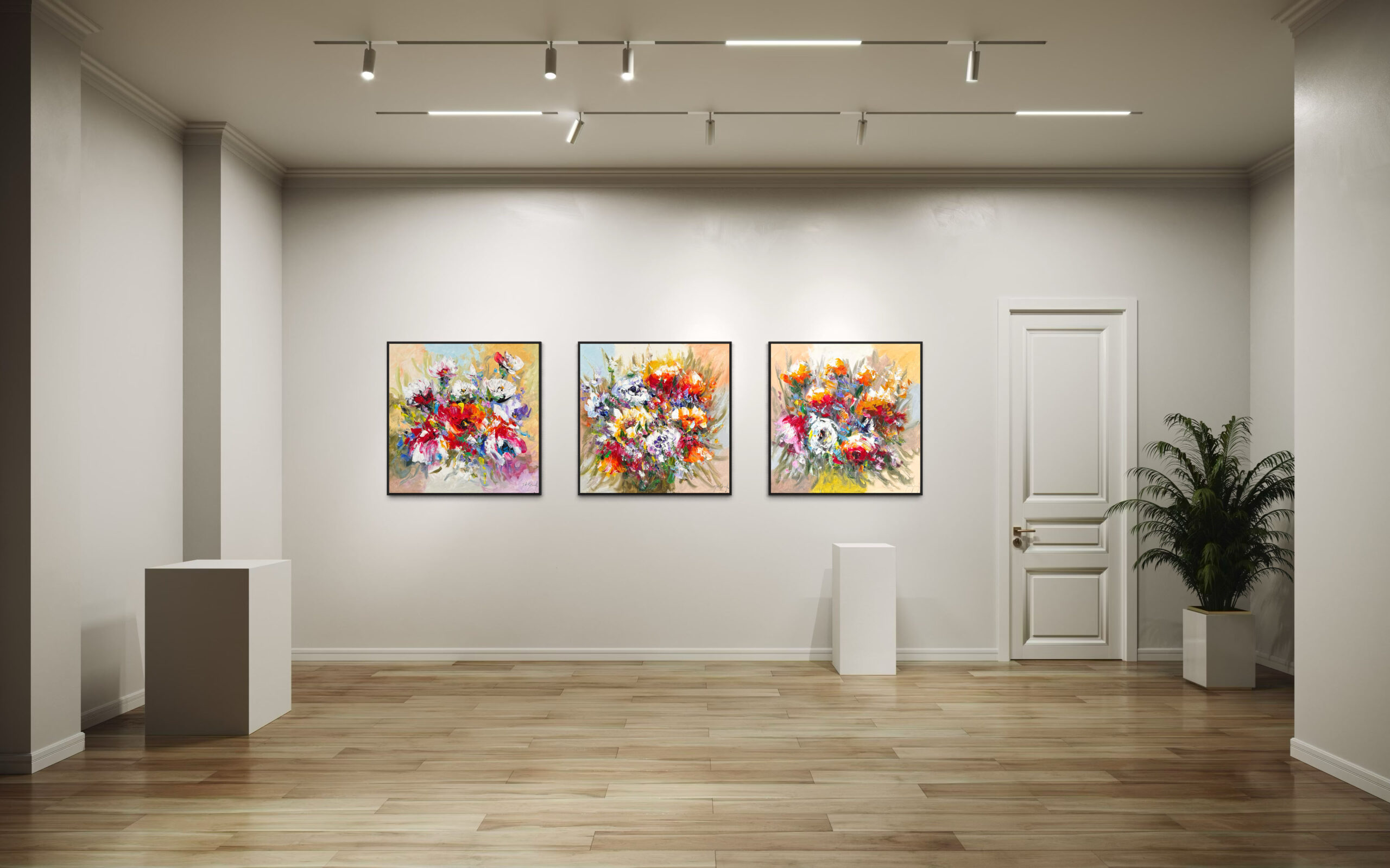
A painting can be strong on its own and still not turn out well on your wall. This is rarely due to the quality of the work. Most often, it’s about proportion. A work that is too small above a spacious sofa looks lost. A canvas that is too large in a compact space can be oppressive.
Therefore, choosing well starts with looking at the place. How wide is the wall? What is underneath it? How much daylight is there? And just as important: Are you looking at it all day, or mainly at a few moments? Art in a transit space should excite immediately. In a sitting area, you often want something you enjoy looking at for a longer period of time.
Color plays a big role in this, but not in the simple way that is often thought. A painting does not have to be the same hues as your interior to match. It is precisely contrast that can make a space stronger. It does help if there is a connection somewhere – in tone, temperature or atmosphere. A powerful work can add tension to a quiet space. A layered, softer palette can actually bring warmth to a sleek interior.
Jochem de Graaf painting and format: this is where it often goes wrong
When choosing a Jochem de Graaf painting, size is frequently underestimated. Online, many works appear smaller or larger than they really are. This quickly creates doubt once the painting actually has to be thought of in the room.
A handy rule of thumb is that art does not have to fill the wall, but it does have to have sufficient mass. Above a dresser or sofa, a painting often works well when it visually covers about two-thirds of the width of the furniture. This is not a hard rule, but it is a useful starting point. With high ceilings, moreover, a work may grab more height than people initially dare.
Viewing distance also counts. In a compact room, you can see brushwork, detail and texture up close. In a larger room, on the other hand, a more powerful gesture works better. That makes size not only a practical choice, but also a substantive one. The perception of the work changes with it.
Choosing original work requires more than a quick click
Viewing art online is pleasant for initial selection, but with painting, the physical experience remains important. Texture, gloss, depth and hue can never be captured with complete accuracy on a screen. What looks subdued in a photograph can be much livelier in reality. And exactly the same applies the other way around.
Therefore, it is wise to ask yourself a few questions before you decide. What attracts you to this work? Is it primarily color, subject matter, composition or atmosphere? Does it fit the place you have in mind? And is that feeling likely to remain once the first impression is over?
That last question is perhaps the most important. A painting doesn’t have to be well behaved, but it should have something that will last longer than just surprise. Especially if you are buying art for a space where you spend a lot of time, you want a work that has not worked itself out after a month.
The role of framing and presentation
Not every painting needs a frame, but presentation always does something. A tray frame can give a work more body and make it stand out more strongly from the wall. A sober frame can bring calm if the painting itself already has a lot of energy. Conversely, a frame that is too present can distract from what you wanted it to express.
There is an immediate practical side to this. The finish helps determine how carefully and convincingly a work of art comes across in your interior. Those who invest in art usually want the whole thing to be just right. That means paying attention to hanging height, lighting and the relationship to other elements in the room.
For many buyers, that’s exactly the point where expert advice is nice. Not to take the choice out of their hands, but to provide reassurance. Sometimes a larger size turns out to work better than expected. Sometimes a different frame or just a different spot makes all the difference.
Buy or experience first?
Not everyone wants to make a final decision right away, and that’s perfectly understandable. You don’t choose art like you choose a side table. You want to know how the work feels in your own environment. Does it really fit the space, the light and your daily rhythm?
Therefore, it is smart to leave room for orientation. Those who hesitate between several works often have no lack of taste but rather an eye for nuance. Then it helps to compare well and, if necessary, first experience how a painting will turn out in the room. Especially with an outspoken work, this extra step can give much peace of mind in the choice.
At Amersfoort Art we often see that people are only really convinced when they view the work in relation to their interior. Then proportions, colors and atmosphere suddenly fall into place. That experience is valuable, precisely because art is personal and does not have to be a standard decision.
For home and office, different emphases apply
A painting for the home may be more intimate, quirky or emotional. You live with it, see it in quiet moments and want it to say something about your taste. For a business environment, the emphasis is often different. There, representation comes into play, but also the question of what a work does for visitors, employees and the appearance of the space.
This does not mean that art in the office should be safe or anonymous. On the contrary. Precisely a strongly chosen painting can make a reception area memorable or give a meeting room more character. Only that the choice there often needs to have broader support. The work must appeal without becoming flat.
That’s why context is so important. A work that feels beautiful in a home may not have the same effect in an office. Conversely, a painting with more visual power may work extremely well in business, while it would be too dominant at home.
What do you pay attention to if you are serious about choosing?
Look at the space first, then the work. That may sound unromantic, but it prevents disappointment. Write down dimensions of the wall, take a picture of the place and pay attention to light, colors and sightlines. Only then will it become clear which format and look are really promising.
Next, take time for the work itself. Not just for what you see immediately, but rather for what lingers. A good painting often does not reveal everything at a glance. It has enough tension to remain interesting, but also enough coherence not to become restless.
And be honest about your goal. Are you looking for an eye-catching piece, a hushed work, something that brings warmth or sharpness? There is no right or wrong, just a choice that better suits your space and way of living or working.
Sometimes the best decision is not in choosing faster, but in looking closer. A painting really comes into its own when it not only looks beautiful in the gallery or on a screen, but also feels natural on your own wall. When that happens, you don’t really need to explain it to yourself anymore.


